The British colour standard: How designers are reviving old colours
Ever wondered how all postboxes are exactly the same colour, or who decided the precise shade of battleship grey to paint battleships? The answer can be found in the 1930s Dictionary of Colour Standards, which is being revived today in the form of homewares
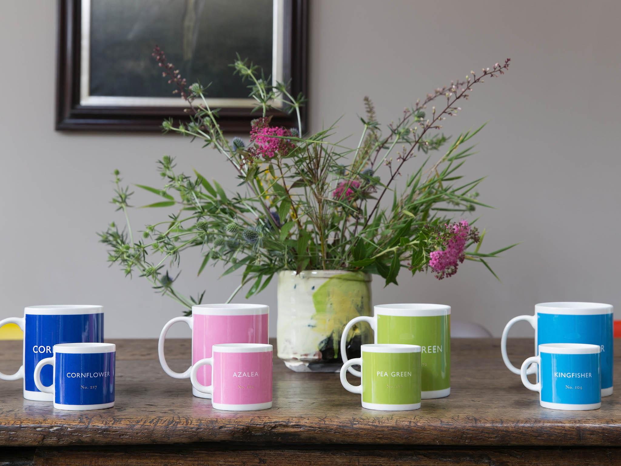
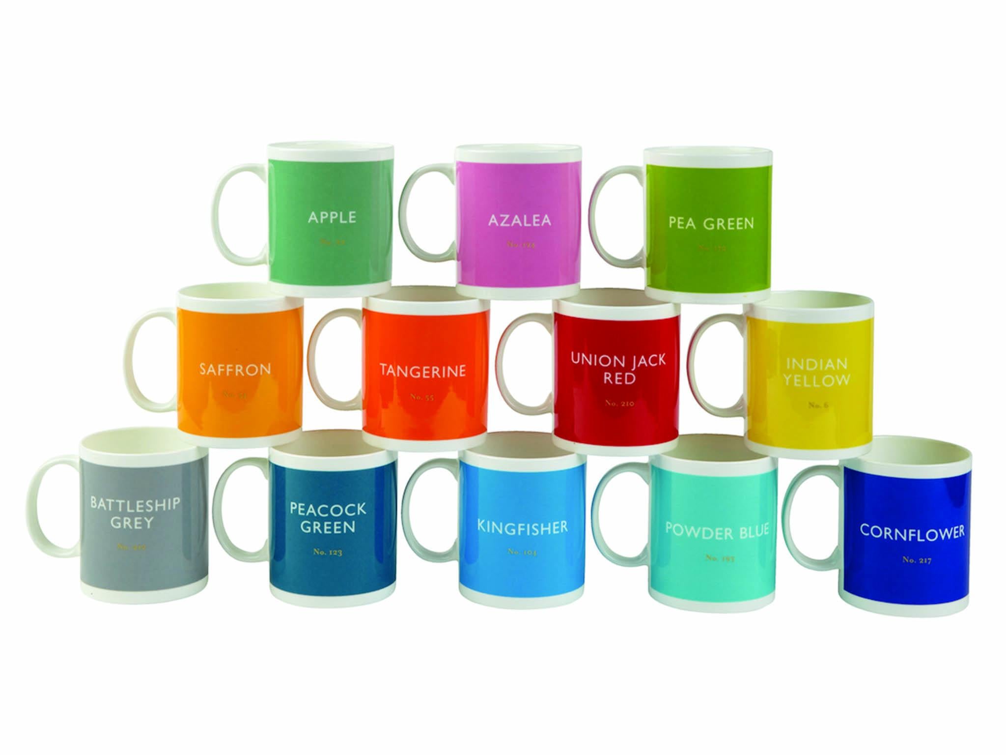
The 1930s British Colour Council Dictionary of Colour Standards is being brought back to life, in the most British way possible – on tea mugs.
Victoria Whitbread and Jackie Piper, the creative duo behind Designed in Colour, rediscovered the book in a charity shop. Inspired by it, the pair have designed bone china mugs which are coated in the bold, traditional colours. Each mug has its own unique number applied in gilt.
The colours have their original and often evocative names – from cornflower blue to Union Jack red, pea green to Indian yellow to battleship grey – printed on the mugs. The names often took inspiration from flora and fauna, so we see colours such as forget-me-not, bee-eater blue, and squirrel.
The pair, who met in Finland as students, have already meticulously logged 600 colours digitally as a colour reference and still have more to come.
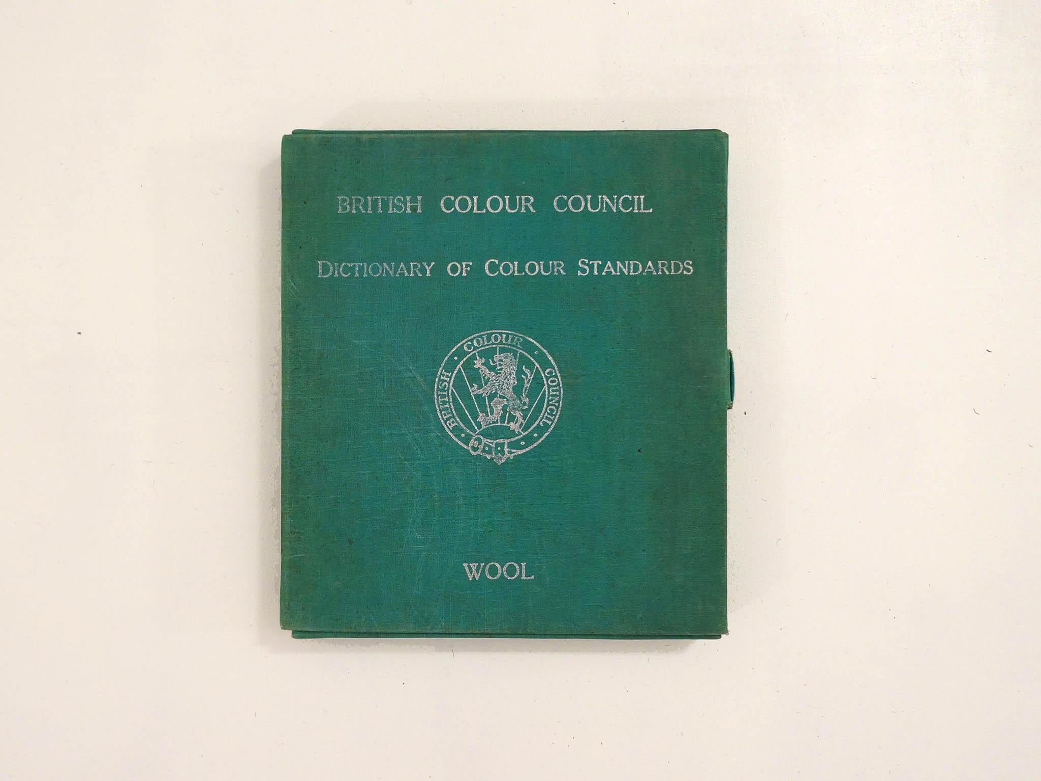
The dictionary was first developed in the 1930s when the British Colour Council was founded by designer Robert Francis Wilson. It was the first major works from the BCC, defining colour shades in printed plates and giving a number codes to varying hues, tones and intensities. It used used dyed strips of ribbon and wool to specify colours for products including uniforms, flags, postboxes and battleships
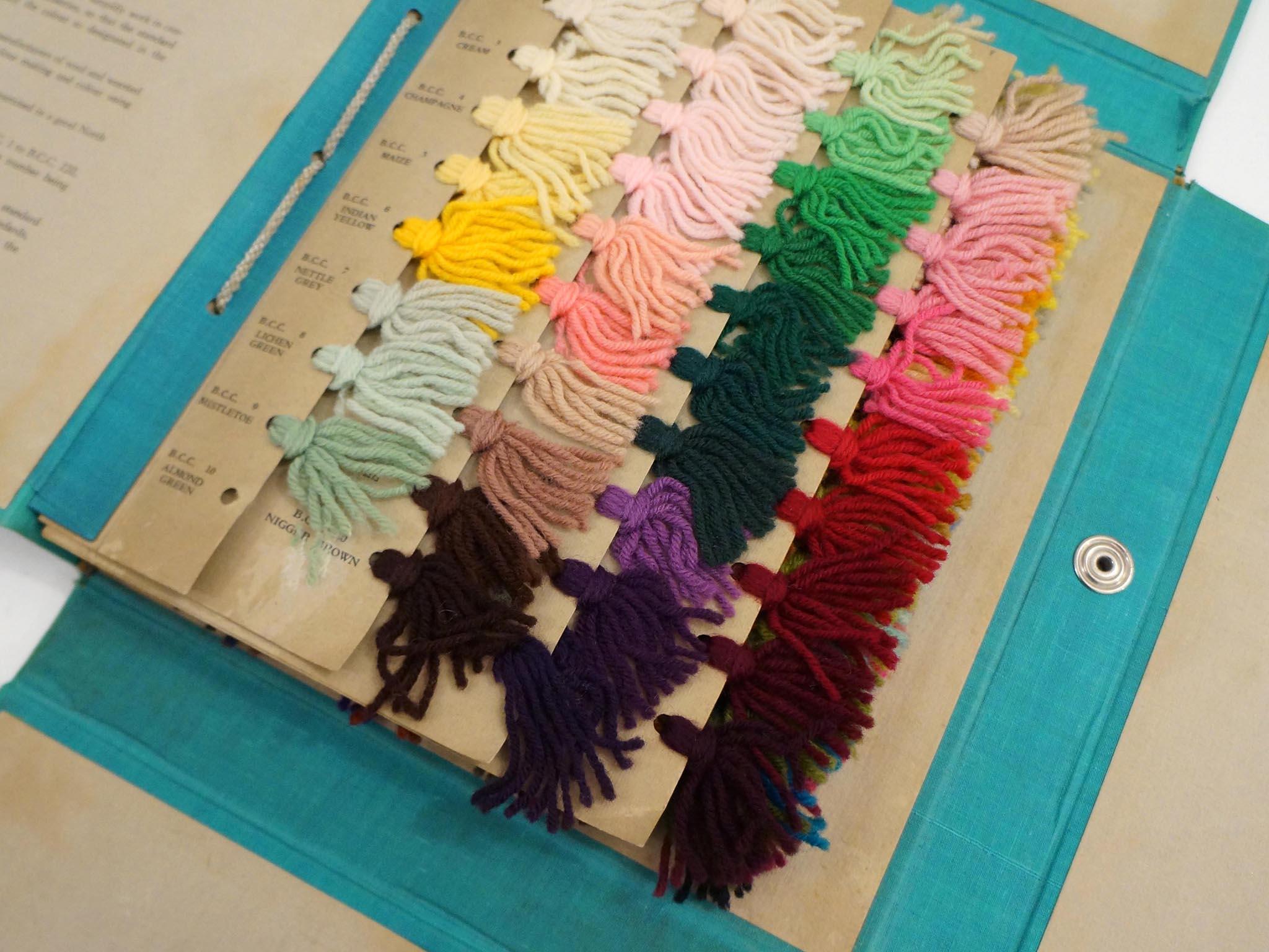
The codes developed into standards for a variety of different industries from the Royal Horticultural Society to the Army, Royal Mail and even the Royal Institute of British Architects, many of which are still used today.
Join our commenting forum
Join thought-provoking conversations, follow other Independent readers and see their replies
Comments