The Independent's journalism is supported by our readers. When you purchase through links on our site, we may earn commission.
Apple just redesigned the Windows logo and made it worse
Apple replaced the Microsoft Windows logo with... a picture of a window
In a masterful piece of (possibly unintentional) corporate shade-throwing, Apple appears to have redesigned Microsoft's logo on its website.
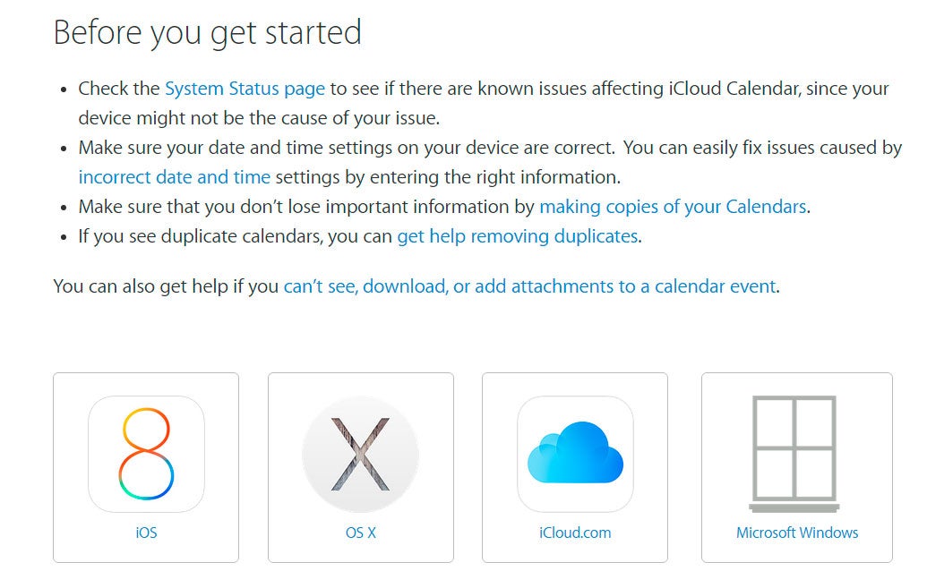
On the Apple Support website for iCloud Calendar, users have to choose which device they are using to get help.
The iOS, OS X and iCloud logos are all correct, but Apple appears to have replaced Microsoft's famous Windows logo with... a drawing of a window.
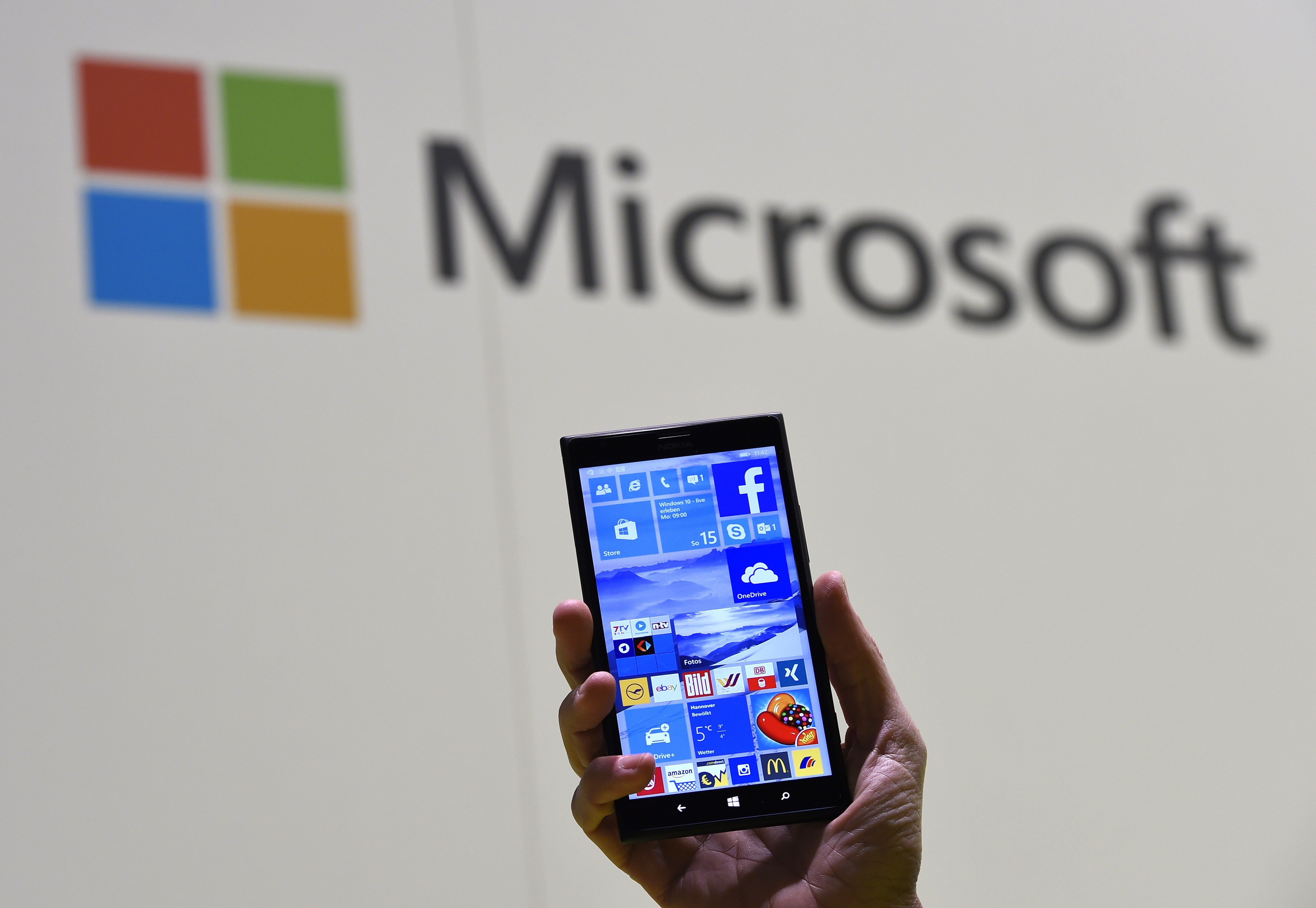
The two companies have long been rivals, but relations have warmed a little recently, as they realise that most of their customers typically use both systems for different things.
At a San Francisco tech conference in September, Apple CEO Tim Cook said: "Apple and Microsoft still compete, but we can partner on more things that we compete on. And that's what customers want."
"[Apple users] love Office, and they want it to work on Mac better than it works on Windows, and it should."
Even though a new era of love and understanding is beginning to develop between the two mega-corporations, it seems like the Apple website designers couldn't manage to find a picture of the Windows logo.
The Apple logo has always been a little sleeker than Windows, but an unsolicited redesign probably isn't the solution.
Join our commenting forum
Join thought-provoking conversations, follow other Independent readers and see their replies
Comments